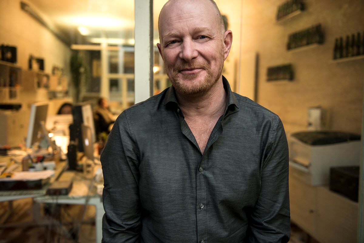
We’ve freshened up our iconic Brouwerij ‘t IJ labels. We kept some of the classic elements, like the diamond and the ostrich, so it’s not a dramatic change. Yet the labels feel ‘crisper’ somehow. Why is that? We asked Gavin Arm, the British founder and Creative Director of design bureau Positivity in Amsterdam. He’s designed our labels for years, and guards their unique look with verve.
You’ve been closely involved with Brouwerij ‘t IJ for more than 10 years now. How did it all start?
I was working at one of Europe’s largest design bureaus, but I decided to start out on my own. I wanted to work with more organic, local companies. So I was already thinking of approaching Brouwerij ‘t IJ. I still remember looking at their labels and thinking: this really needs help! But, whilst it was not the best design it also had something magical about it. I’d worked for other beer brands before, and when I looked at the labels with that knowledge in mind, it just wasn’t working. But the ostrich gave the label something really special. So I was itching to get started.
It just so happened that one of the owners lived on my street, and a few days after we met by chance we sat down to talk about the labels. I initially thought we’d be changing everything, but like I said; the labels had something special. So in the end I changed everything – and nothing. Where I thought we’d be looking at a revolutionary approach, it ended up being an evolution. In principle, I shifted around the elements of the ‘pack architecture’ – the basic structure. You can see a label as a kind of architecture; where you put the name, the description, etc. That needed changing completely. But that ostrich, standing proudly in the middle, it just had something magical. Overall, when I look back on what I did 10 years ago, I’m really proud of it.

After redesigning the original labels, you and Positivity went on to design a lot of new labels for new beers. How did that go?
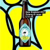
When ‘t IJ started doing collabs and special editions, it was a great way to show the creative side of the IJ. The labels were a bit off-beat and unusual. The charm of ‘t IJ is that it’s never been ‘standard’; that gave us the opportunity to lay it on even thicker. The IPA label is a good example. It was originally intended as a one-off brew. But people really liked it. The label was a great way to express ‘t IJ’s rebelliousness. I still remember thinking: honeslty, nobody would get away with a label like that in the UK! But I got that bizarre commission, sketched the design fairly quickly, and then we didn’t have to change much about it. It surprised me that they accepted the design, but typically for the IJ, they said: Let’s just do it! It wasn’t a commercial choice, and to me it really expresses what makes ‘t IJ unique.

How does it normally go with their commissions? Do you have free rein? Or do you get specific instructions?
It’s much less formal than most of the other companies I work for. Sometimes we just sit down with a beer to brainstorm. When it comes to that, we’re really close, like partners. I consider the people I work with at ‘t IJ as real design partners. I don’t have any other customers who play such an important role in the design.
Does designing a beer label require a different approach than other commissions?
I’m not sure why, but some designers just have a better sense for it than others. It seems to be a personal thing.Every beer drinker will see right away if a label isn’t right, and then they just don’t want to drink that beer, so it has to feel right, and have the right ‘fit’ for the beer. I’ve been involved in their labels for so long now that I can sense intuitively if something fits ‘t IJ or not.
And when does something fit ‘t IJ? How would you describe it in essence?
To me, it’s down to earth, but uncompromising. ‘t IJ has an open and friendly personality, but with a rough edge. So you have to be able to see that when you take a bottle of ‘t IJ off the shelf – without needing a marketing guru standing next to you explaining what it all means. It’s like how you can tell at a glance that some beers were probably brewed by a few Belgian monks.

How do you do that? What makes a good label?
I honestly have no idea, ha ha! It needs to have personality. Even the simplest designs need to express that personality. In fact, I believe that even the most boring beers deserve more than a boring label. You want to hold something special in your hand. Especially if the beer itself is actually unique, like that of ‘t IJ. That’s what you need to express in the label. I still see plenty of designs out there that I think are pretty bad. But on the other hand: take a label like La Chouffe. Yes, it’s ridiculous, yet also it somehow works. At the studio, we’ve often talked in the team if it’s even possible to make it better – some love it, some hate it! That’s kind of what I did with the labels for ‘t IJ in the beginning, there were people who loved the old labels, and that’s always something to think about.
You had the chance to freshen up the labels again, but they had to keep the essence. Was that difficult?
It certainly wasn’t an easy job – after being so close to the design, but I’m so proud of what we’ve achieved. We used just a few subtle tweaks and accents, but they give it an even stronger, more iconic look. The colours are a bit more expressive. It was quite a challenge, because you don’t want to destroy what’s already been built over the years. Plus, there were several beers that had quite different origins and personalities. Like the IJbock, with the horns that originally looked a bit like dildos. We made the designs more consistent, without losing their eccentricities. The IPA label isn’t coming back, and replacing it was a bit of a challenge. It wasn’t originally intended to be a long-term design when it came out 10 years ago. We’ve learned to love it since then, of course, but I think it’s good that the IPA fits in better with the rest now. The new labels took a lot of work, and I’m veryhappy with them. The labels have clearly changed, but when you put the old labels next to the new ones, you see that they’re still the same beer. But I’ll still look back fondly on the old labels – and I’ll probably laugh a little too.
Finally: which beer is your personal favourite?
Like most people, it’s probably the evil IJwit. It’s just so damned good! I’m completely hooked. I still remember when I came to the brewery for our first meeting and drank my first IJwit. Wow! It’s really a dangerous beer, because it’s so easy to drink… But the new Free IPA is also a phenomenal beer, because it has all the personality of an IJ beer, but with only 0.5 percent alcohol. I love it! And the low-alcohol version of the IJwit is also on its way: the VrijWit. If it’s half as good as the IJwit, then it’ll be a smash success…